


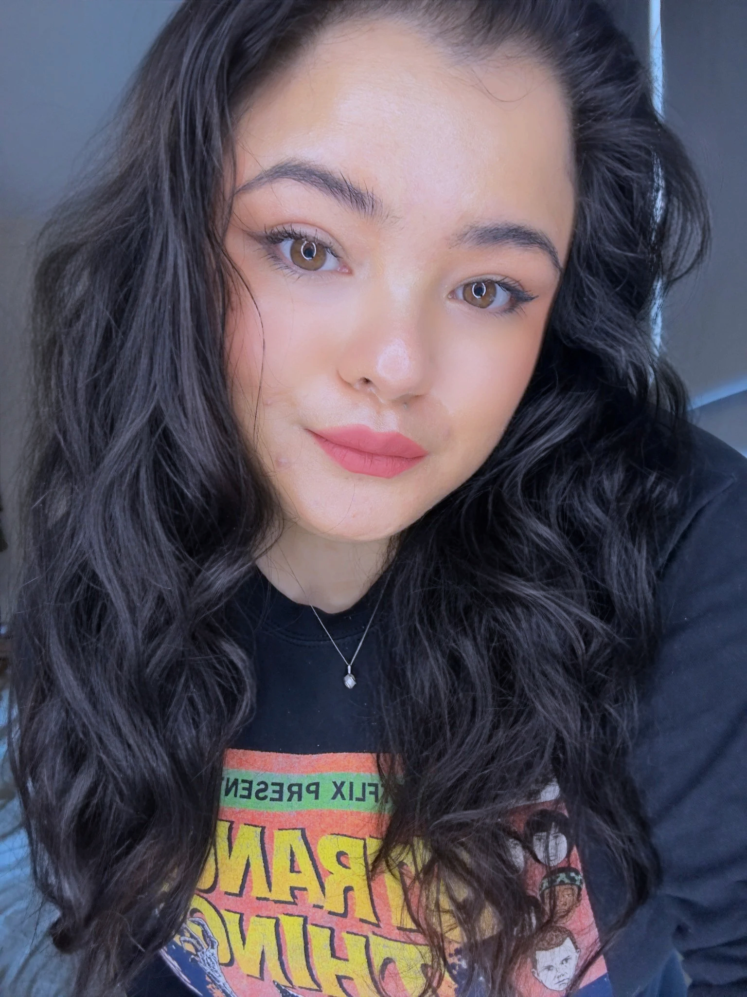
OH HI
i’m ANGE
Based in Cardiff, Wales, working globally, I specialise in fitness, wellness, and performance-led brands — often partnering early, when direction matters most.
I help founders build brands that are clear, considered, and built to last.
This work is for businesses that want more than surface-level design — but don’t need unnecessary complexity either. I work at the point where strategy and design meet, shaping brand systems that make sense from the start and hold up as a business grows.
Whether we’re laying strong foundations or building something more expansive, the goal is the same: a brand that feels confident, cohesive, and aligned with where you’re going.
If you’re looking for fast, throwaway design, this won’t be the right fit.
If you want to do it properly — you’re in the right place.
“Strong brands don’t explain themselves. They arrive fully formed.”
OUR MISSION
To build the brand your work deserves.
Not a logo. Not a vibe.
A brand with structure — designed to hold weight.
Our mission is to take what’s already there — the conviction, the ambition, the thing that’s hard to articulate — and give it clarity, direction, and form. So your brand makes sense not just now, but as it grows.
We help founders build brands that feel cohesive and recognisable early on, and remain relevant across platforms, products, and time.
This work is for people who are ready to stop patching things together and start building with intention. Who know they’re creating something serious and want their brand to reflect that.
No noise. No trend-chasing.
Just thoughtful, considered brand work — done properly.
OUR VALUES
What we don’t compromise on.
-
We don’t design in circles.
Conviction means clear direction — rooted in strategy, not personal taste or trends. We help you make decisions you can stand behind, so your brand doesn’t feel tentative or apologetic.This is about backing an idea properly, not hedging it.
-
Good brands don’t rely on constant explanation.
Structure is what turns ideas into something usable — across your website, socials, spaces, and products. It’s how your brand stays consistent as it grows, without becoming rigid or boring.
Clear foundations now mean fewer problems later.
-
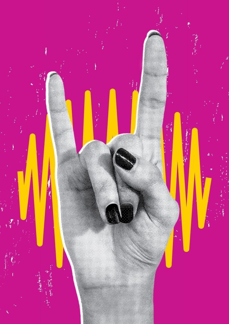
The most memorable brands hold contrast.
Tension is the balance between restraint and edge — clarity and personality. We don’t smooth everything out. We keep what makes your brand interesting, while giving it enough control to scale.
Polished, but not bland. Distinct, but not chaotic.
-
We design with the long game in mind.
Endurance means thinking beyond launch day — so your brand still works when you expand, pivot, or mature. Not trend-led. Not disposable. Built to stay relevant without needing constant reinvention.
These aren’t values for display.
They’re the conditions required to build brands that endure.
Our Process
How a brand becomes a world.
This isn’t a creative journey.
It’s brand infrastructure — built to last.
-
We dig beneath the surface: into your story, your grit, your contradictions, the sharp truths you don’t always say out loud. This is where we unearth the raw material — the energy, instincts, and edges that will become the backbone of your brand.
We delve into the landscape around your brand — not just what it is, but what it’s up against.
Your audience.
Your category.
Your tension.
Your unfair advantage.This is where we identify what actually matters — and strip away everything that doesn’t.
Clarity comes before creativity. Always.
-
This is where strategy and imagination collide. Here, the brand takes shape.
We define your point of view, your role in the market, and the stance your brand is willing to hold — even when it’s uncomfortable.
This isn’t about reinvention for the sake of it.
It’s about alignment.Once positioning is locked, every decision becomes easier — and sharper.
-
Strategy is translated into a complete visual and verbal system.
Identity, typography, colour, tone, layout, hierarchy.
Nothing isolated. Nothing accidental.This is where the brand becomes legible — recognisable before it’s understood.
Designed to scale. The goal isn’t just recognition; it’s immersion. We build a world your audience wants to step into, live in, and claim as their own.
-
The brand expands into its environment.
Digital. Social. Print. Motion. Physical space.
Every touchpoint working from the same internal logic.This is where the brand stops feeling like an asset
and starts behaving like a world. -
You leave with a complete, scalable ecosystem — not loose files or half-finished ideas.
Clear systems.
Defined rules.
Assets built for real-world use.Your brand is ready to launch, grow, and evolve without losing coherence.